Role | Art Director/ Designer
- Logo Design
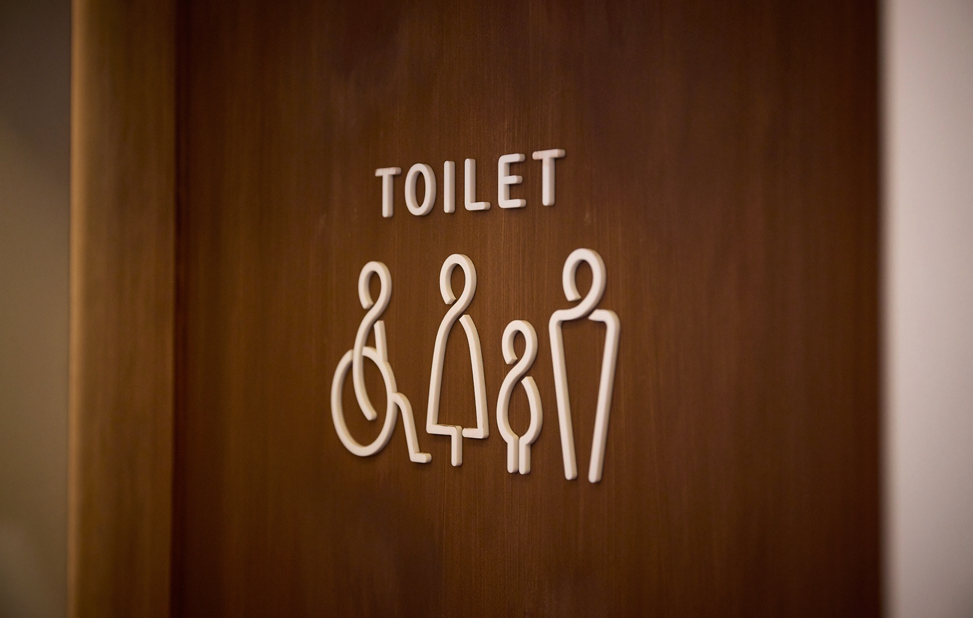
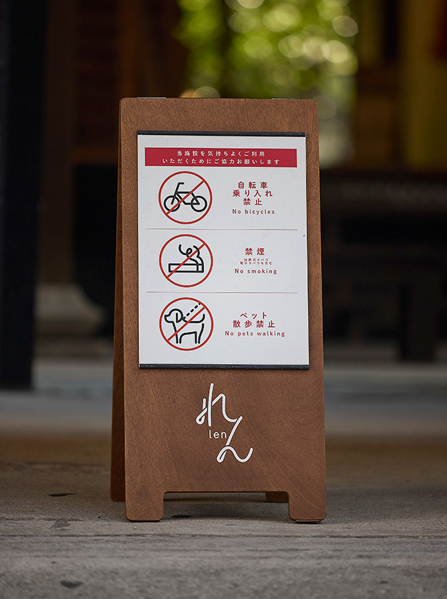
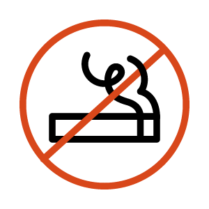
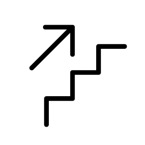
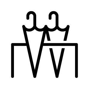
- Signage Icon
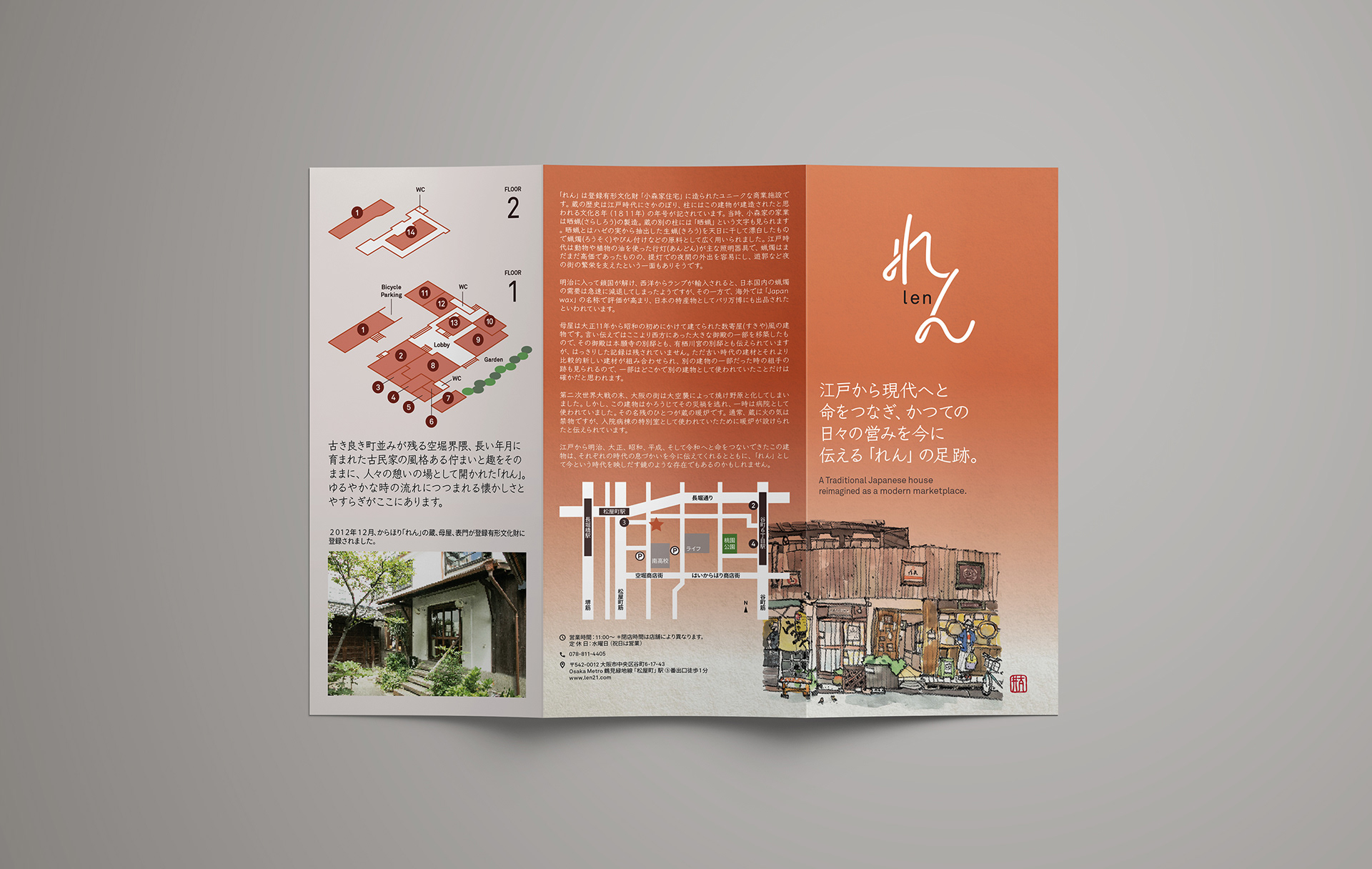
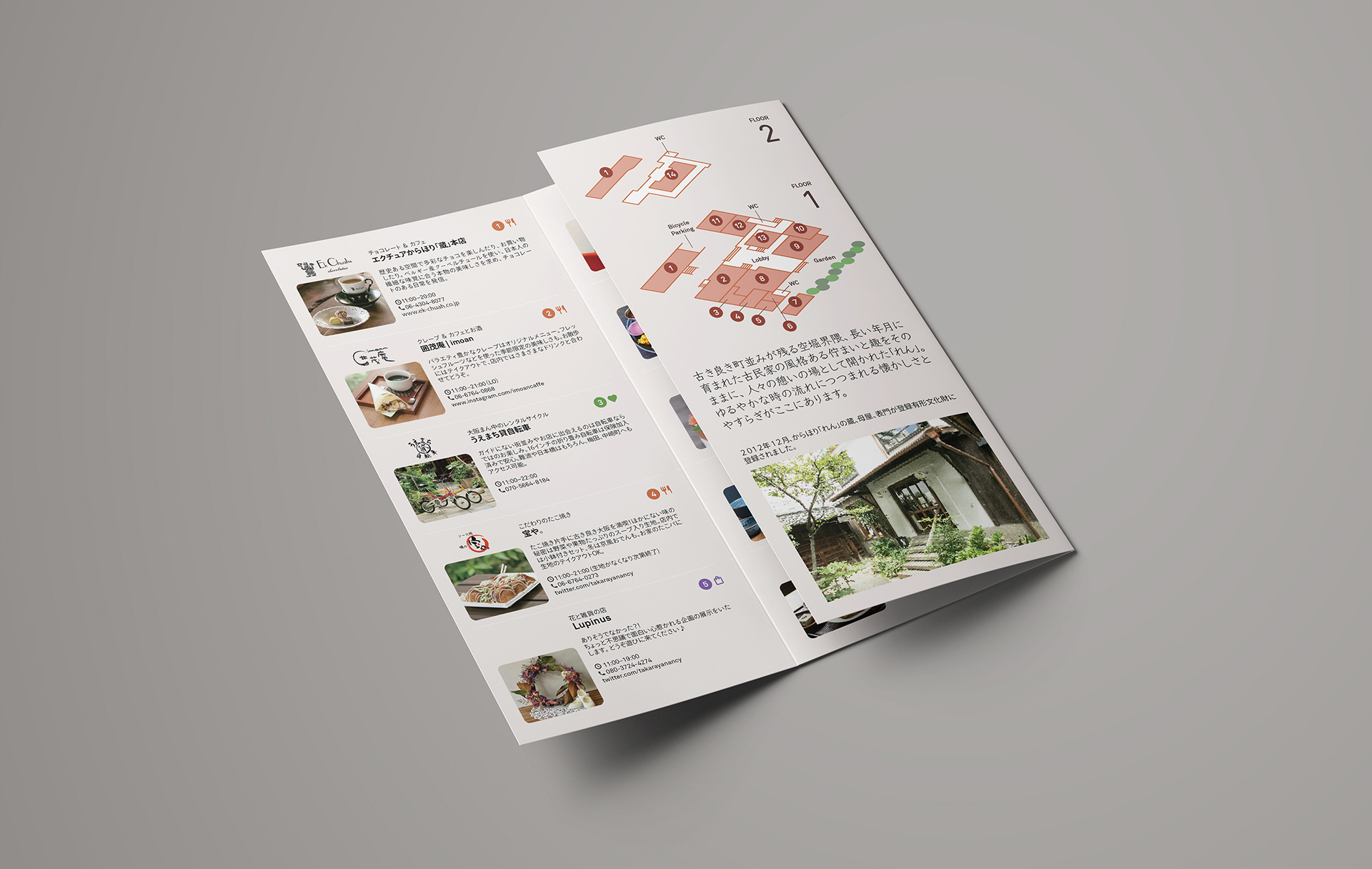
- Brochure
- Signage & website consultation
- Logo Design
- Signage Icon
- Brochure
- Signage & website consultation
Challenge
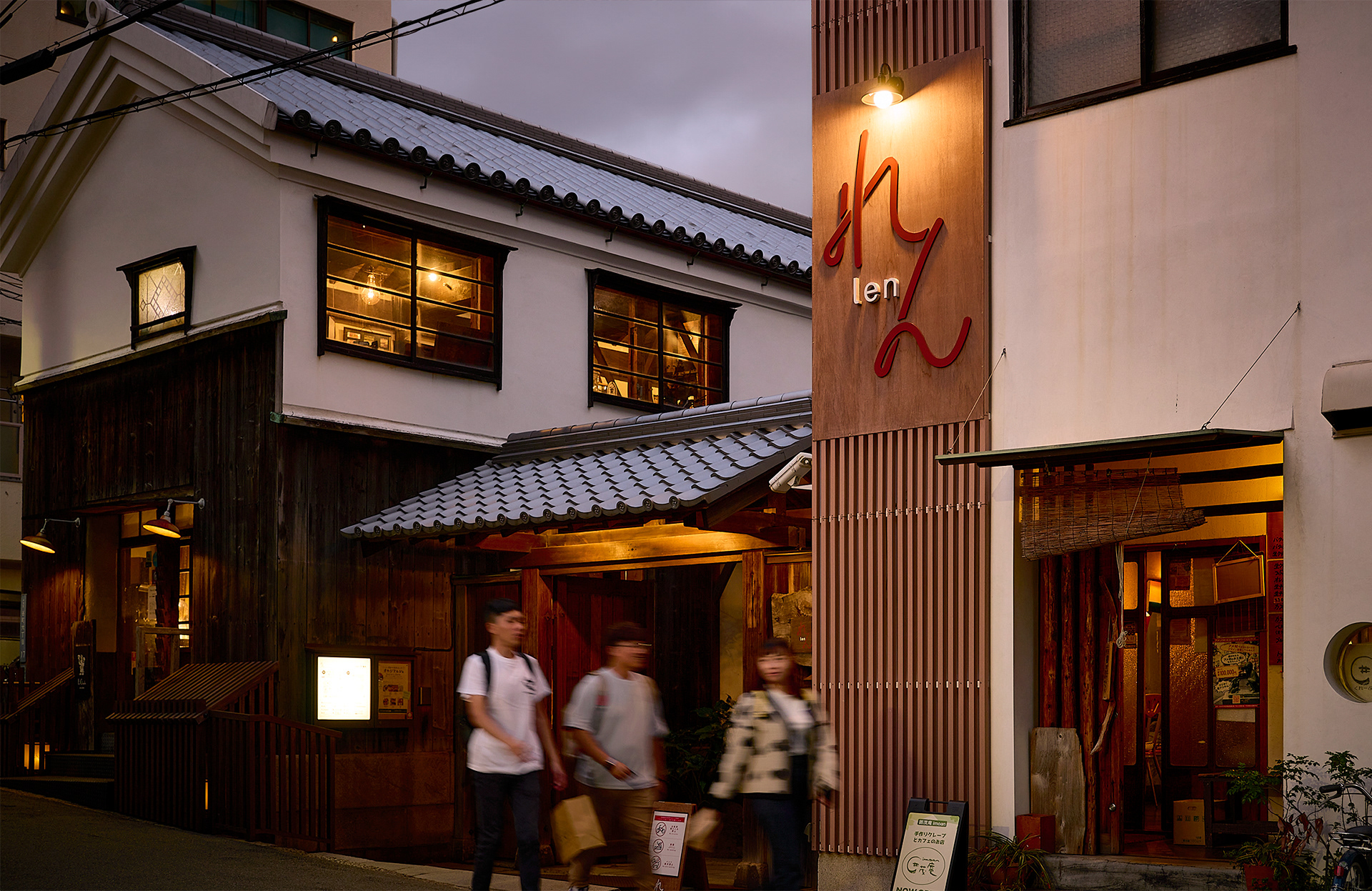
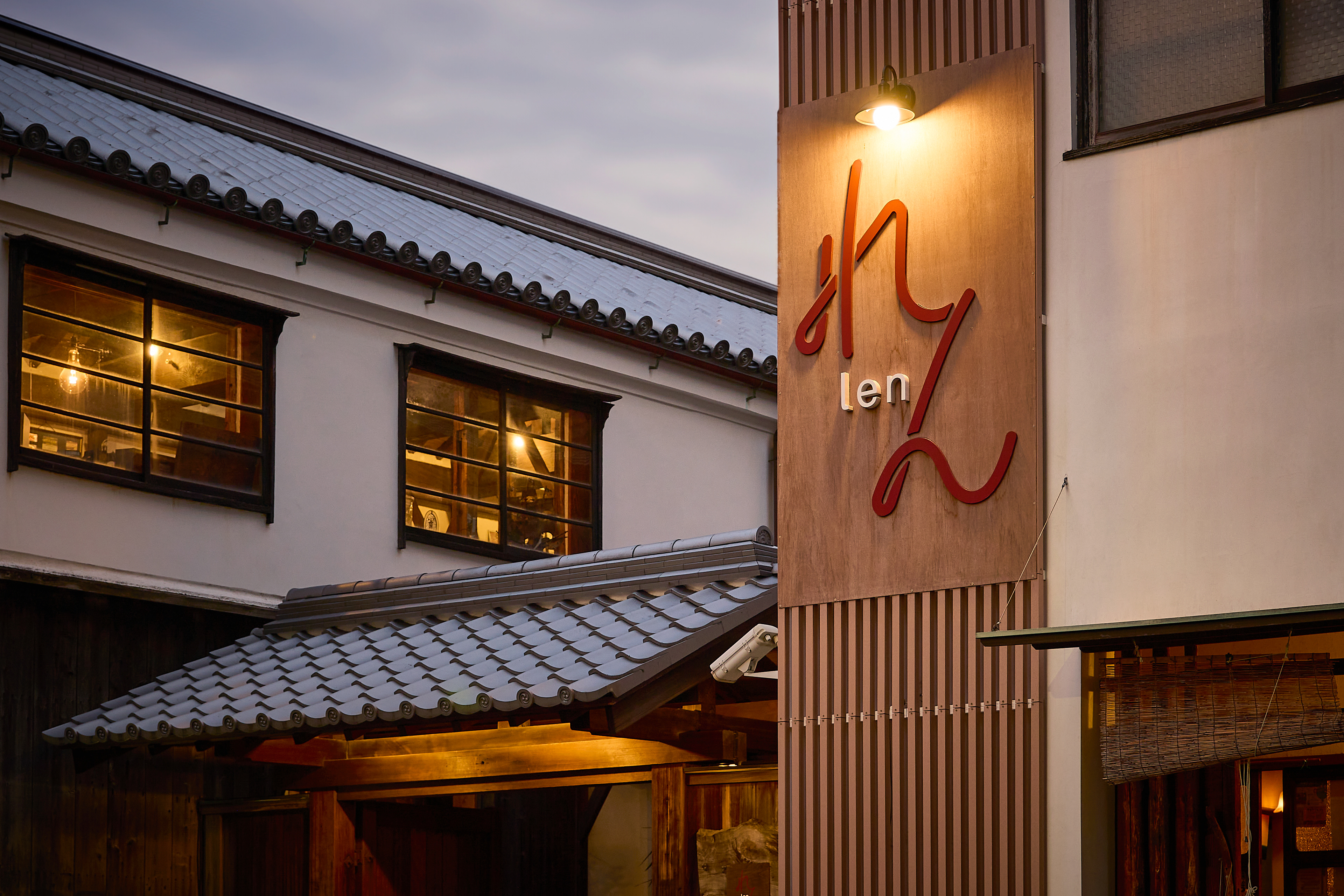
Len's 20th-anniversary milestone motivated the property management team to transition the identity rooted in traditional Japanese aesthetics to a more modern interpretation. The goal of the rebranding is to position Len as a vibrant space where tradition meets new ideas while encapsulating the building's historical essence. Additionally, the owner desired to create a meaningful tribute to his mother, who lived there as a child long before its conversion into a commercial space.
Solution
We created a new identity that allows diverse interpretations and bridges tradition and modernity by spelling the name in hiragana instead of kanji, which defines the meaning. Inspired by architectural details and the owner's mother's calligraphy, we introduced a continuous line as a visual metaphor, symbolizing connection-making. The new branding celebrates Len's history and role as a space where people and new ideas come together.